
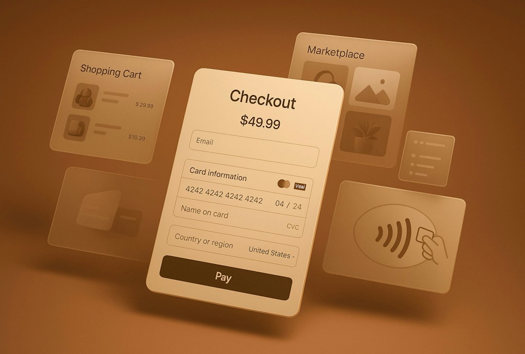
Use Mobbins for quick app screenshots, but keep these six alternatives close when you need deeper flows, fresher patterns, or broader product ideas. That matters because mobile users are impatient: Google found that when page load time rises from 1 to 3 seconds, bounce probability rises by 32% [source: Google]. Good UI references help teams spot friction before users complain.
TLDR: The best Mobbins alternatives are Page Flows, UI Sources, Screenlane, Nicelydone, Refero, and Pttrns. If your team is redesigning onboarding, you might review 25 login and signup flows in Page Flows, then compare 40 mobile screens in Screenlane before opening Figma. That can save hours of guessing and reduce weak design choices early. Use these tools together, not as a single replacement.
1. Page Flows
Best for: seeing full user journeys, not just pretty single screens.
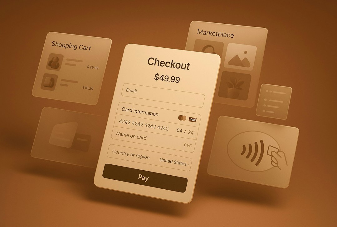
Page Flows is one of the strongest Mobbins alternatives if you care about what happens before and after a screen. It records full app and website flows, including signups, upgrades, cancellations, searches, and checkout paths.
This is useful because real UX happens in steps. A perfect pricing screen means little if the payment step feels clumsy. Page Flows helps you see how polished products handle the messy bits.
- Great for: onboarding, checkout, empty states, upgrade prompts.
- Weak spot: it can feel more research-heavy than quick inspiration.
- Use it when: you need to map a flow from first tap to final action.
The catch is that browsing can take longer than expected. You may open one flow and suddenly spend 20 minutes comparing small button choices. Still, that is often time well spent.
2. UI Sources
Best for: practical mobile patterns from popular apps.
UI Sources focuses on real app interactions and user flows. It is especially helpful for product designers who want more than a screenshot wall. You can study how apps ask for permissions, handle subscriptions, explain features, and recover from errors.
It feels close to product work. Less mood board. More “how did they solve this exact problem?” That makes it useful for teams building apps under a deadline.
- Great for: user flows, permission prompts, paywalls, onboarding.
- Weak spot: some categories may feel thinner than others.
- Use it when: you want evidence before making UX decisions.
3. Screenlane
Best for: clean, fast mobile UI inspiration.
Screenlane is simple in a good way. It offers curated mobile screens from real apps, sorted by patterns and categories. If Mobbins feels packed, Screenlane can feel calmer.
It is especially handy for quick visual checks. Need ideas for a settings screen? A calendar view? A search result layout? Screenlane gets you there without much effort.
It drives me crazy that some UI libraries bury basic categories behind too many filters. Screenlane avoids most of that. You can scan fast and spot useful ideas in seconds.
- Great for: visual research, layout ideas, mobile components.
- Weak spot: fewer deep flows than tools like Page Flows.
- Use it when: you need quick design direction before wireframing.
4. Nicelydone
Best for: SaaS and product design references.
Nicelydone is not only about mobile apps. That is the benefit. Many products today move between mobile, desktop, email, billing, and account screens. Nicelydone lets you study product patterns across those touchpoints.
Use it when your app is part of a bigger service. For example, a banking app, fitness product, course platform, or B2B tool. The mobile screen may be only one piece of the whole experience.
- Great for: SaaS flows, dashboards, pricing, account areas.
- Weak spot: mobile-only designers may need to filter more carefully.
- Use it when: the user journey includes more than the app itself.
5. Refero
Best for: broad product inspiration across real websites and apps.
Refero is useful when your idea is still rough. It collects real product screens and helps you browse by category, company, and pattern. The mix is wide, which is helpful when you do not want to copy one app category too closely.
For example, a finance app might borrow a progress pattern from education. A travel app might use a saved-items idea from ecommerce. Refero makes that kind of cross-category research easier.
- Great for: early research, product patterns, creative comparison.
- Weak spot: broad libraries can feel noisy if you lack a clear goal.
- Use it when: you want ideas outside your usual app niche.
6. Pttrns
Best for: classic mobile UI pattern browsing.
Pttrns has been around for a while, and that is part of its charm. It is direct, familiar, and focused on mobile interface patterns. You can browse common categories like activity feeds, profiles, onboarding, settings, and media screens.
It may not feel as polished as newer tools in every area, but it still works well for quick checks. If you are designing a standard mobile screen, Pttrns can help you avoid starting from a blank canvas.
- Great for: common mobile screens, simple reference hunting.
- Weak spot: some examples can feel older than what you see in newer apps.
- Use it when: you need a fast pattern library, not a full research session.
How to choose the right Mobbins alternative
Do not pick one tool and call it done. Match the tool to the job.
- Need full flows? Choose Page Flows or UI Sources.
- Need fast screen ideas? Try Screenlane or Pttrns.
- Need product-wide references? Use Nicelydone.
- Need broad inspiration? Open Refero.
Also, set a timer. Inspiration can turn into procrastination very fast. Spend 20 minutes collecting references, then write down what you learned. What patterns repeat? Where do apps reduce effort? Which screens feel clear at first glance?
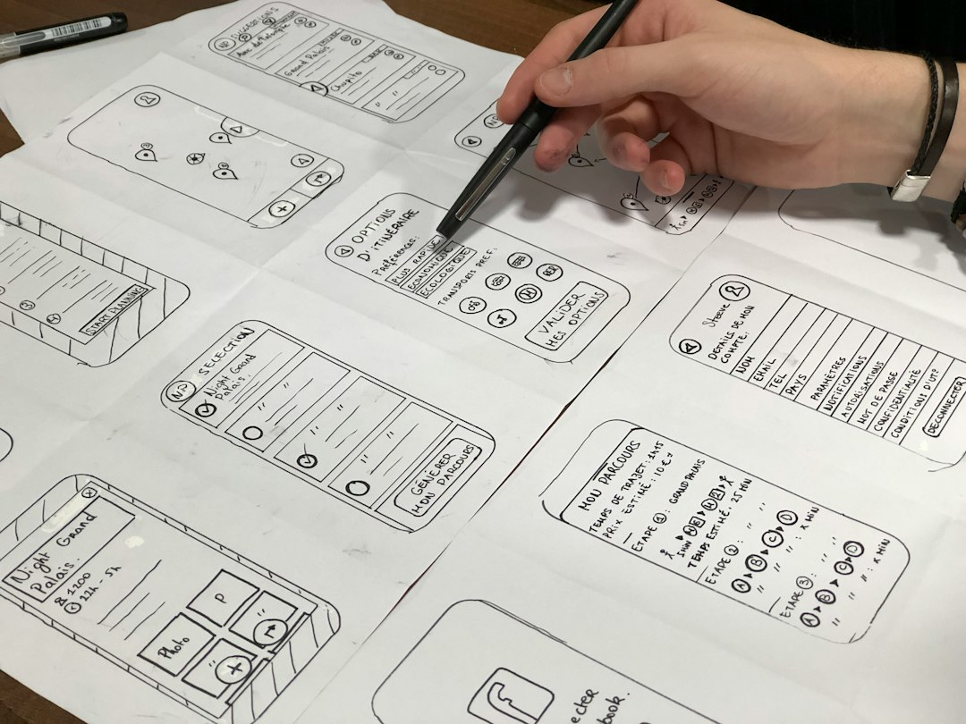
The best UI references do not give you a design to copy. They give you better questions. Why is this button placed here? Why does this onboarding step come later? Why does this paywall feel fair instead of pushy?
That is how these Mobbins alternatives help you build better user experiences. They shorten the blank-page phase. They expose weak flows. They show how strong apps guide users with less friction. And honestly, that is where better mobile design usually starts.