
Color is a tiny thing with a huge voice. A red box can shout “party” in one country and “warning” in another. A white dress can feel fresh in one place and sad in another. This is why smart global brands do not just translate words. They also translate colors.
TLDR: Global brands adapt colors because colors mean different things in different cultures. Red may feel lucky in China, while white may feel serious or linked to mourning in parts of Asia. Brands keep their main identity, but they tweak packaging, ads, websites, and campaigns for each market. The best strategy is simple: stay recognizable, but feel local.
What Is a Localized Color Strategy?
A localized color strategy means changing or adjusting brand colors for a specific country, culture, or region. The brand does not throw away its identity. It just gives it a local outfit.
Think of it like traveling. You are still you. But you might wear a jacket in Paris, sandals in Bali, and something red for Lunar New Year in Shanghai. Brands do the same.
They may change colors in:
- Packaging, like boxes, bottles, and bags.
- Ads, such as posters and social media posts.
- Websites, including buttons and banners.
- Seasonal campaigns, like holidays or festivals.
- Store design, such as signs, walls, and menus.
The goal is clear. The brand must look familiar. But it must also feel right for local people.
Why Colors Change From Place to Place
Colors carry stories. These stories come from history, religion, politics, food, nature, and family traditions. So the same color can send different signals.
Here are a few common examples:
- Red can mean luck, joy, love, danger, or urgency.
- White can mean purity, peace, death, or mourning.
- Green can mean nature, health, money, or religion.
- Gold can mean wealth, celebration, or premium quality.
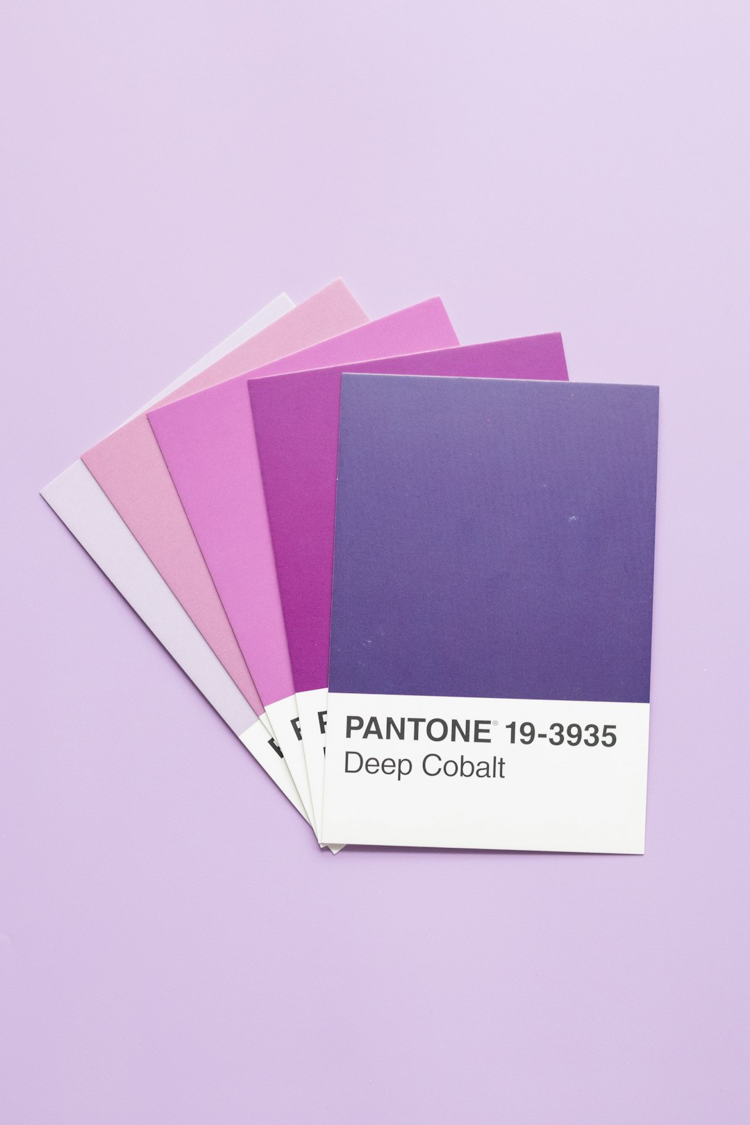
- Purple can mean luxury, mystery, spirituality, or sadness.
- Black can mean elegance, power, grief, or rebellion.
That is a lot for one little color. No wonder brands do their homework.
Example 1: Coca-Cola and the Power of Red
Coca-Cola is one of the best examples of a brand that protects its color. Its red is famous. You can spot it from far away. The brand does not usually replace that red. Instead, it adds local color accents.
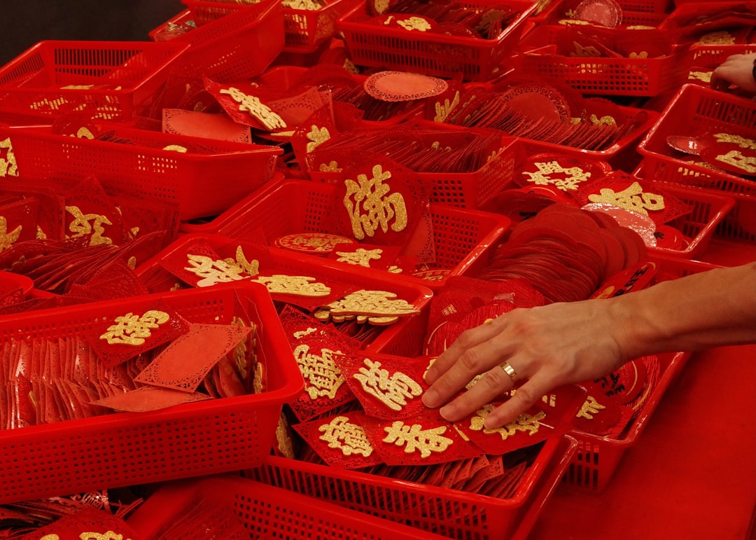
In China, Coca-Cola often uses gold with red during Lunar New Year. This works well because red and gold are linked with good luck, wealth, and celebration. The can still feels like Coke. But it also feels festive and local.
This is a clever move. Coke keeps its global voice. Then it adds a local smile.
Example 2: McDonald’s and the Green Makeover
McDonald’s is famous for red and yellow. Red grabs attention. Yellow feels happy and fast. Together, they say, “Come in. Eat fries. Be joyful.”
But in many European markets, McDonald’s started using more green in signs and store design. Why? Green suggests nature, freshness, and responsibility. It helps the brand look more modern and eco-conscious.
The golden arches are still there. The fries are still there. But the overall feeling changes. It becomes softer. Less “fast food rush.” More “clean and fresh.”
This shows a key rule. A brand can keep its main symbol while changing the background mood.
Example 3: Starbucks and Respect for Local Taste
Starbucks has a very strong color identity. Its deep green feels calm, earthy, and premium. It also links to coffee culture and comfort.
In some markets, Starbucks adjusts store interiors and seasonal visuals to match local design tastes. In China, for example, limited edition products may use red and gold during important festivals. In the Middle East, richer tones and elegant patterns may appear in store design or packaging.
The green siren logo remains a steady anchor. Around it, the brand can play. This is smart. Customers recognize the brand at once. But the local touches make it feel less foreign.
Example 4: KitKat and Local Flavor Colors in Japan
KitKat in Japan is a color adventure. The brand is famous there for unusual local flavors. Matcha. Sakura. Wasabi. Sweet potato. Even sake.
Each flavor often gets its own color story. Matcha uses green. Sakura uses pink. Premium gifts may use gold, black, or deep red. These colors help shoppers understand the flavor before reading a word.
This is color localization plus product localization. It is not just “same chocolate, new wrapper.” It is a whole local experience.
Also, it is fun. And fun sells.
Example 5: Apple and Seasonal Color Drops
Apple is usually clean and minimal. White, black, silver, and soft gray are part of its visual world. These colors say, “simple, premium, calm.”
But Apple sometimes uses special colors for local or seasonal campaigns. Around Lunar New Year, the brand may use red in wallpapers, gift cards, packaging details, or ads in Asian markets. Red adds warmth and celebration without damaging Apple’s clean style.
This is a great lesson. You do not need to repaint the whole brand. Sometimes a small color accent does the job.
How Brands Choose the Right Local Colors
Good color localization is not random. It is not someone saying, “Blue looks cute today.” It takes research.
Brands usually look at:
- Culture: What does the color mean to local people?
- Religion: Does the color have sacred meaning?
- History: Is the color linked to politics or past events?
- Competitors: Which colors are already owned by rivals?
- Shopping habits: Which colors stand out on shelves?
- Festivals: Which colors matter during holidays?
Then they test. They ask local teams. They show designs to real customers. They check if people understand the message.

The Big Risk: Getting It Wrong
Color mistakes can be awkward. Sometimes funny. Sometimes expensive.
A luxury brand might use white packaging in a market where white is linked to mourning. A food brand might use too much black and make the product look heavy or unsafe. A cheerful campaign might use colors tied to political groups. Oops.
This is why local experts matter. They catch things that a global office may miss.
Color is emotional. People may not explain why something feels wrong. They just feel it. And then they do not buy.
How to Keep a Brand Consistent
Here is the tricky part. If a brand changes too much, it loses itself. If it changes too little, it feels cold and foreign.
The answer is balance.
- Keep the core brand color in place.
- Add local accent colors for campaigns.
- Use local colors in limited editions.
- Adjust backgrounds, patterns, and packaging details.
- Do not change everything at once.
Imagine Nike without black, white, or bold contrast. Strange, right? But Nike can still use national colors for sports events. It can use red and gold for China. Green and gold for Brazil. Blue and white for Greece. The swoosh stays the hero.
Simple Tips for Any Brand
You do not need to be Coca-Cola or Apple to use localized color strategy. Small brands can do it too.
Try this simple plan:
- Start with your main color. Protect it.
- Pick one or two local accents. Do not make a rainbow soup.
- Ask local people. Guessing is risky.
- Test your design. Watch real reactions.
- Change by season. Holidays are great moments for color shifts.
- Stay readable. Pretty colors still need clear text.
Final Thought
Localized color strategy is not about chasing trends. It is about respect. It tells customers, “We see you. We understand your world.”
The best global brands know this. They do not just ship the same red, green, blue, or gold everywhere. They listen first. Then they color with care.
So next time you see a familiar brand in a new color, look closer. It may not be random. It may be a smart little cultural wink.