
Use Gemini when you need broad visual directions quickly, and use Claude when you need cleaner product logic, better flows, and sharper UI critique. For UI concept generation, Gemini often feels more visual and exploratory, while Claude tends to be more structured, careful, and product-minded. The best choice depends on whether you want more ideas or better reasoning behind fewer ideas.
TLDR: Gemini is strong for fast UI ideation, visual variation, and turning rough prompts into multiple interface directions. Claude is better when the concept needs clear user flows, accessibility notes, error states, and convincing product rationale. For example, a small SaaS team trying to redesign a billing dashboard might get 8–10 quick layout ideas from Gemini in minutes, then use Claude to reduce them into 2 polished concepts with stronger hierarchy. In a practical workflow, expect Gemini to save around 20–30% of early brainstorming time, while Claude can cut revision cycles by making the concept less vague.
What “UI concept generation” really means
Generating a UI concept is not just asking an AI tool to “make a dashboard.” That usually gives you generic cards, a sidebar, and a button that says “Get Started.” Useful UI concept work includes layout, user intent, content priority, visual tone, edge cases, and interaction logic.
A good AI assistant should help answer questions like:
- What should the user see first?
- Which actions deserve the most visual weight?
- What should happen when data is missing?
- How does the screen change on mobile?
- Does the design feel premium, playful, technical, or calm?
This is where Gemini and Claude start to feel different. Gemini is often better at generating a spread of ideas. Claude is usually better at explaining why one idea works and another one does not.
Where Gemini shines for UI design
Gemini is strong when the brief is still loose. If you say, “Create three UI concepts for a fitness habit app aimed at beginners,” it can produce distinct directions quickly. One might be playful and card-based. Another might be minimal and data-focused. A third might center on coaching and motivation.
That speed is useful at the messy start of a project. You do not always know what you want yet. Gemini helps you see options faster, especially when you ask for style references, layout alternatives, and component ideas.
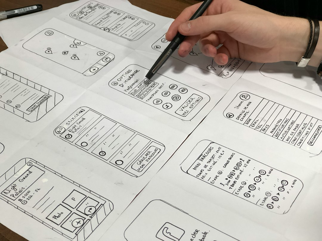
Gemini also performs well with visual input. If you upload a screenshot, mood board, wireframe, or rough sketch, it can comment on structure, visual hierarchy, and possible improvements. This makes it useful for early reviews, especially when your team has half-formed ideas scattered across screenshots and notes.
Best Gemini use cases include:
- Generating several homepage concepts for a new app.
- Turning a rough feature list into screen ideas.
- Comparing different visual tones, such as calm, bold, or editorial.
- Reading screenshots and suggesting layout changes.
- Creating quick content blocks for landing pages and onboarding screens.
The catch is that Gemini can sometimes stay too broad. It may give attractive UI language without enough decision-making. You might get “clean cards,” “modern gradients,” and “intuitive navigation” again and again. That sounds nice, but it can feel thin when you need a real product screen.
Where Claude shines for UI concepts
Claude is often better when the design problem has rules. Give it a user type, a business goal, a screen purpose, and a few constraints, and it tends to produce more thoughtful concepts. It is especially good at structuring flows and spotting gaps.
For example, if you ask Claude for a subscription management screen, it may include current plan details, usage limits, next billing date, upgrade prompts, cancellation paths, invoices, payment method states, and support access. That is less flashy than a visual mood board, but far more useful for product work.
Claude also tends to write stronger design rationale. It can explain why the primary call to action belongs in one place, why destructive actions need separation, and why certain labels reduce confusion. This is helpful when presenting concepts to founders, product managers, or engineers who need logic, not just taste.
Best Claude use cases include:
- Designing complex SaaS screens with permissions, billing, or analytics.
- Creating user flows before visual design starts.
- Writing UX rationale for stakeholders.
- Reviewing accessibility, empty states, and error states.
- Turning a concept into structured design requirements.
Honestly, it feels like Claude wastes less time on decorative filler. If you ask for a serious admin interface, it usually stays closer to the job. Gemini may produce more visual variety, but Claude is more likely to ask, “What does the user need to do next?”
Prompting Gemini vs prompting Claude
Gemini works well with prompts that ask for range. Use it when you want multiple directions, visual approaches, or layout experiments.
Example Gemini prompt:
“Generate five distinct UI concepts for a mobile banking app dashboard for young professionals. For each concept, describe the layout, visual style, main modules, color mood, and one standout interaction.”
Claude works better with prompts that include goals, constraints, and user behavior. Feed it the problem, not just the screen type.
Example Claude prompt:
“Design a UI concept for a mobile banking dashboard. The user wants to check spending, avoid overdraft, and pay bills quickly. Include hierarchy, key components, empty states, accessibility concerns, and a short rationale for each section.”
The difference is subtle but real. Gemini responds well to creative breadth. Claude responds well to product depth.
Visual style: Gemini has the edge early
If your priority is mood, Gemini usually feels more useful. It can suggest visual systems, hero layouts, screen patterns, and brand-like directions with speed. For early branding-adjacent UI work, that matters.
Say you are building a meditation app. Gemini might suggest a soft gradient interface, a nature-inspired layout, a monochrome premium version, and a journal-first concept. That gives designers several starting points fast.
Claude can also propose visual styles, but it often describes them in a more restrained way. That can be good for mature products. It can be less exciting when you need wild options on day one.
UX logic: Claude is stronger
For UX logic, Claude usually wins. It tends to think through the sequence of actions more carefully. It is better at saying what happens before, during, and after the main user task.
This matters in screens that are not purely promotional. Settings pages, checkout flows, admin panels, booking systems, medical forms, and analytics tools all need careful structure. Pretty is not enough.
Claude is also good at catching missing states. These include loading, empty, error, success, permission denied, and partial data states. Designers know these details always appear later and create extra work. Getting them earlier is a relief.
Code and prototypes
Both Gemini and Claude can generate front-end code for UI concepts. Claude often has an advantage when turning an idea into a tidy prototype, especially when you want organized React components, clear naming, and readable structure. Gemini can also produce usable code, but it may need more cleanup depending on the request.
If your goal is a quick visual mockup, either tool can help. If your goal is a prototype that an engineer can inspect without sighing deeply, Claude often feels safer. Still, you should expect manual review. AI-generated code can look polished while hiding weak responsiveness, bloated styling, or odd component structure.
Which one should designers use?
For most UI concept work, the smartest answer is not Gemini or Claude. It is Gemini then Claude.
- Start with Gemini to generate broad visual concepts and layout options.
- Pick the strongest two or three directions based on user goals and brand fit.
- Move to Claude to refine flow, hierarchy, states, and rationale.
- Return to Gemini if you need more visual variations on the chosen direction.
- Finish in your design tool with real spacing, components, and user testing.
This workflow keeps each model in its strongest role. Gemini opens the creative field. Claude tightens the product thinking.
Final verdict
Gemini is better for visual exploration. It is fast, flexible, and good at generating many UI directions from a loose brief. Use it when the project still needs shape.
Claude is better for product-ready concepts. It is stronger at structure, user intent, accessibility, and explaining design choices. Use it when the concept needs to survive stakeholder review or guide production.
If you are designing a landing page, mood-driven app, or early pitch concept, start with Gemini. If you are designing a dashboard, workflow, settings area, or checkout flow, bring in Claude early. The best UI work still needs human taste, product judgment, and testing, but these tools can remove a lot of blank-page pain.