
A great tournament banner does more than announce an event. It builds anticipation, guides participants, celebrates sponsors, and gives fans something memorable to photograph. Whether you are organizing a school championship, a citywide sports league, an esports competition, or a weekend charity tournament, the right banner design can make the event feel more professional, energetic, and worth attending.
TLDR: A strong tournament banner should be bold, readable, and visually connected to the sport or competition it represents. Use clear hierarchy, powerful colors, team or event branding, and only the most important information. Add dynamic imagery, sponsor placement, and durable materials to make the banner useful both in photos and at the venue. The best designs balance excitement with clarity so spectators instantly understand what is happening and where to go.
Why Tournament Banners Matter
Tournament banners are often one of the first visual elements people notice when they arrive at an event. They help set the tone before the first whistle, serve, kickoff, match, or round begins. A well-designed banner can communicate scale, energy, and credibility in just a few seconds.
For sports and competitive events, banners also play practical roles. They can mark the entrance, identify courts or fields, display schedules, celebrate finalists, showcase sponsors, or create a backdrop for award photos. In other words, a tournament banner is not only decoration; it is part of the event experience.
Because tournaments are naturally exciting, your banner should reflect that sense of motion and momentum. The design should feel alive, even when it is printed on vinyl, fabric, mesh, or foam board.
Start with a Clear Purpose
Before choosing colors or graphics, decide what the banner is supposed to do. A single banner cannot always accomplish everything. The design for a main entrance banner will differ from a sponsor banner, a championship photo backdrop, or a directional sign.
Common tournament banner purposes include:
- Event announcement: Promotes the tournament name, date, location, and main theme.
- Welcome banner: Greets athletes, coaches, families, and fans at the venue entrance.
- Schedule or bracket banner: Helps attendees follow matchups, rounds, and times.
- Sponsor banner: Displays partner logos in a clean and respectful layout.
- Awards backdrop: Creates a professional photo area for winners and finalists.
- Team spirit banner: Supports a specific team, club, school, or player.
Once the purpose is clear, every design choice becomes easier. A welcome banner can be emotional and celebratory, while a schedule banner should prioritize readability above all else.
Use Bold Typography for Instant Readability
At a busy tournament, people may see your banner from across a gym, field, hall, or parking lot. That means typography must be large, strong, and easy to read at a distance. Decorative fonts may look interesting on a screen, but they can become difficult to understand when printed wide and viewed quickly.
For most tournament banners, use one powerful headline font and one simple supporting font. The event name should be the largest element, followed by the date, venue, division, or call to action. Avoid crowding the design with too many font styles.
Good typography practices include:
- Use uppercase text for short, high-impact headings.
- Keep body details in a clean sans-serif font.
- Make key information readable from at least several meters away.
- Use strong contrast between text and background.
- Avoid placing important text over busy photographs unless you add a dark or light overlay.
For example, a banner that says “2026 Regional Volleyball Finals” should make that phrase impossible to miss. Details like “Saturday, March 14” or “Court 2 Entrance” can be smaller, but they still need space and contrast.
Choose Colors That Match the Energy of the Event
Color is one of the fastest ways to create emotion. A basketball tournament may look great with orange, black, and metallic silver. A tennis event might use green, white, and yellow. A martial arts championship may feel more intense with red, black, and gold. Esports tournaments often lean into neon colors, electric blue, purple, or high-contrast gradients.
The key is to select a palette that supports the mood of the event. Bright colors create excitement and visibility, while dark colors can feel dramatic and premium. Metallic tones such as gold, silver, and bronze work well for finals, championships, and awards ceremonies.
If the tournament belongs to a school, club, league, or organization, use official brand colors whenever possible. This builds recognition and helps the banner look connected to uniforms, programs, social media graphics, and merchandise.
Add Motion with Shapes, Lines, and Action Imagery
Sports are about movement, speed, strategy, and emotion. A flat, static banner can feel less exciting than the event itself. To create energy, use diagonal lines, swooshes, speed trails, impact bursts, or layered geometric shapes. These elements can suggest movement without overwhelming the information.
Action photography is another effective option. A soccer player striking a ball, a sprinter launching from the blocks, a gamer focused at a keyboard, or a swimmer breaking through water can immediately identify the type of competition. If you use photos, choose images with strong lighting, clear subjects, and enough empty space for text.
Tip: Cutout athletes placed over abstract backgrounds can create a dramatic poster-style effect. This is especially useful for championship banners, player spotlights, and finals promotions.

Build a Strong Visual Hierarchy
Visual hierarchy means arranging design elements so the viewer knows what to read first, second, and third. Without hierarchy, a banner can become a wall of text. With hierarchy, it becomes easy and satisfying to understand.
A simple hierarchy might look like this:
- Main event title: The largest text on the banner.
- Sport or competition type: A supporting phrase, icon, or image.
- Date and venue: Essential event details.
- Call to action or direction: “Register Now,” “Championship Court,” or “Awards Stage.”
- Sponsors and partners: Clearly visible but not competing with the title.
If every element is the same size, nothing stands out. Give the main message breathing room. White space, or negative space, is not wasted space. It helps the most important information feel more confident and professional.
Design Ideas by Event Type
Different competitions call for different visual styles. While the basic rules of clarity and impact remain the same, the mood can change dramatically depending on the audience and setting.
School and Youth Sports Tournaments
For school tournaments, banners should feel spirited, friendly, and proud. Use school colors, mascots, team names, and motivational phrases. Designs can include playful patterns, illustrated equipment, or group photos. Because parents and students often take photos with these banners, make sure the event name and year are clearly visible.
Ideas include:
- “Road to the Championship” theme with bracket graphics.
- Mascot in an action pose.
- Class year or season printed prominently.
- Space for athletes to sign the banner after the event.
Corporate or Charity Tournaments
Corporate golf outings, charity runs, and fundraising sports days need a polished look. The design should be energetic but not chaotic. Use refined typography, balanced sponsor placement, and a clear message about the cause or organization.
A charity tournament banner might include a short emotional line such as “Competing for a Cause” or “Every Point Makes a Difference.” This connects the competition to the larger purpose behind it.
Championship and Finals Events
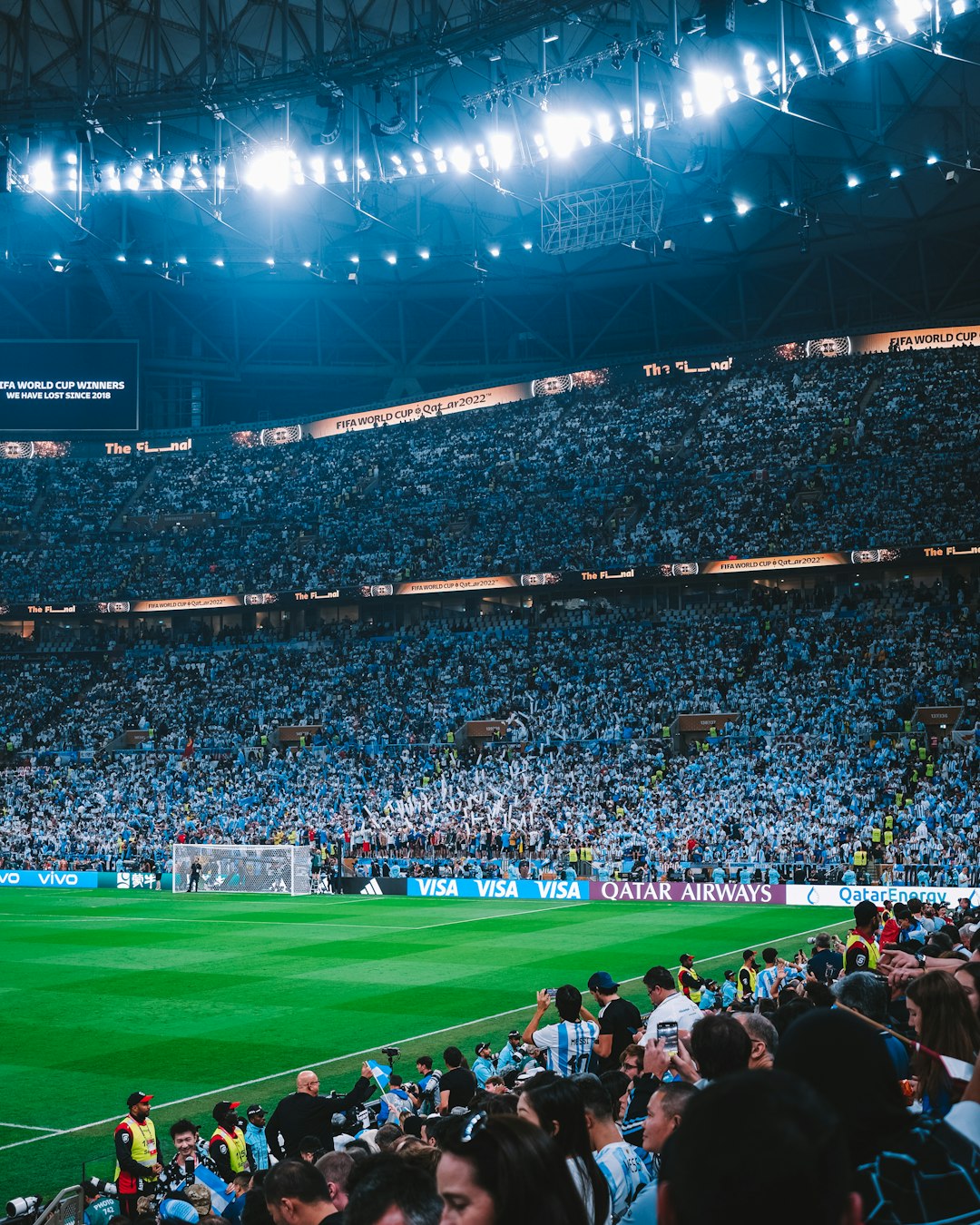
Championship banners should feel prestigious. Use dramatic lighting effects, gold accents, trophy imagery, and strong contrast. Words like Finals, Championship, Elite, and Showdown can add intensity when used tastefully.
For finals, consider a design that looks great in photos. Winners will likely stand in front of this banner holding medals, trophies, or certificates, so avoid placing important text too low where it may be blocked by people.
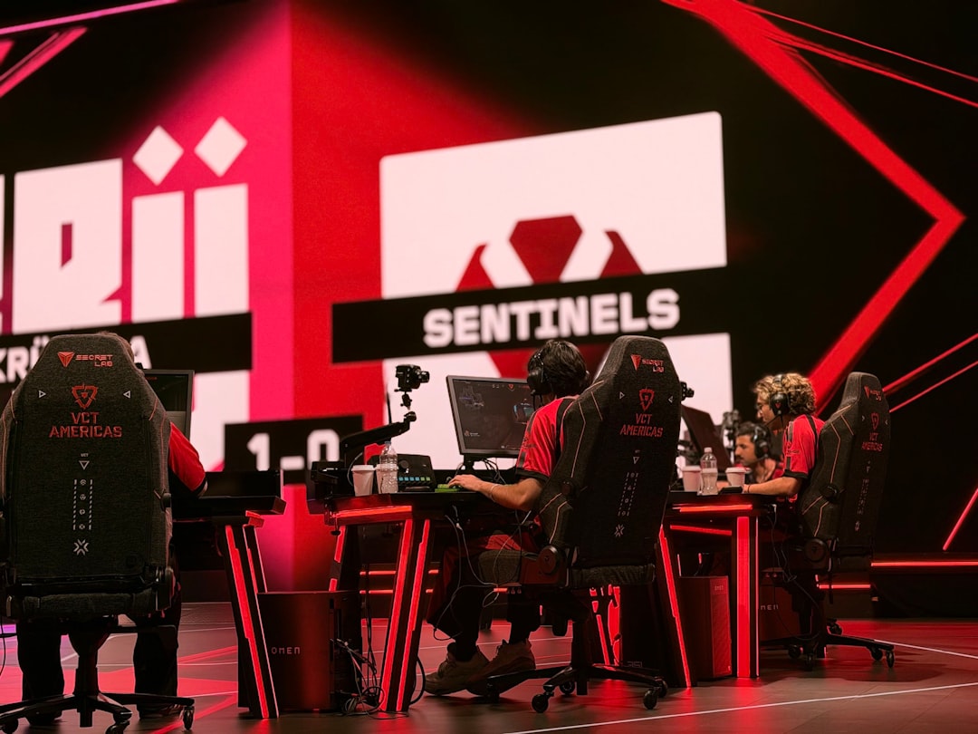
Esports and Gaming Tournaments
Esports banners can be more futuristic and graphic-heavy than traditional sports banners. Neon gradients, glitch effects, digital grids, sharp angular shapes, and character silhouettes are all effective. However, readability still matters. The tournament name, game title, date, and streaming or venue information should remain clear.
Consider adding QR codes for live brackets, registration, streaming channels, or event rules. Just make sure they are large enough to scan and placed in an uncluttered area.
Smart Sponsor Placement
Sponsors often help make tournaments possible, so their logos deserve thoughtful placement. The challenge is to include them without making the banner look like a crowded bulletin board. Arrange sponsor logos in a clean row or grid, usually near the bottom or side of the banner.
If there are different sponsorship levels, create size differences while keeping the layout balanced. For example, a title sponsor may appear near the event name, while supporting sponsors appear in a footer section.
Always leave enough padding around logos. A cramped sponsor area can look unprofessional and may reduce logo visibility in photos or from a distance.
Material and Placement Considerations
Design is only part of the process. The banner must also work in its physical environment. Outdoor tournaments require weather-resistant materials, reinforced edges, and secure hanging options. Indoor banners may allow for lighter materials and more detailed printing.
Common banner materials include:
- Vinyl: Durable, affordable, and suitable for most indoor or outdoor uses.
- Mesh: Good for windy outdoor locations because air can pass through it.
- Fabric: Excellent for premium indoor displays and photo backdrops.
- Retractable stands: Ideal for registration desks, entrances, and sponsor displays.
- Foam board or rigid signs: Useful for wayfinding, schedules, and smaller indoor displays.
Think about where the banner will be viewed. A fence banner at a baseball field needs different proportions than a vertical banner near a registration table. A backdrop for award photos should be wide enough for multiple people and high enough to remain visible behind them.
Information to Include and What to Leave Out
The most common mistake in tournament banner design is trying to include too much information. A banner is not a brochure. It should give viewers the essential message quickly.
Usually, a tournament banner should include:
- Event or tournament name
- Sport or competition type
- Date and location
- Host organization or league
- Key sponsor logos
- Website, QR code, or social handle if useful
Details such as full rules, long schedules, detailed maps, and lengthy sponsor descriptions are better placed in programs, websites, handouts, or digital displays. If the banner is for wayfinding, keep it extremely simple: “Registration,” “Field 3,” “Check In,” “Awards,” or “Spectator Entrance.”
Creative Finishing Touches
Small details can make a tournament banner feel custom and memorable. Add a subtle texture connected to the sport, such as turf, hardwood, court lines, water ripples, racing asphalt, or digital pixels. Use icons of equipment, trophies, brackets, medals, or scoreboards to reinforce the theme.
You can also design a series of matching banners instead of one standalone piece. For example, a tournament might have a welcome banner, court signs, sponsor boards, photo backdrop, and champion banner all using the same colors, fonts, and graphic style. This creates a unified event identity and looks excellent in photos and videos.
Final Thoughts
An effective tournament banner captures the spirit of competition while helping people understand the event at a glance. It should be bold enough to attract attention, clear enough to read quickly, and polished enough to represent the organizers, athletes, and sponsors well.
When designing, focus on purpose, hierarchy, color, typography, imagery, and placement. Keep the message simple, make the visuals energetic, and consider how the banner will appear both in person and in photos. With the right design choices, a tournament banner can become more than signage; it can become part of the excitement, identity, and lasting memory of the event.