In land management, trust is often established before a client ever walks a property line with you. A well-designed logo can signal that your business understands soil, water, wildlife, boundaries, compliance, stewardship, and long-term value. Whether you serve private landowners, developers, municipalities, conservation groups, ranches, or forestry clients, your visual identity should communicate professionalism, environmental awareness, and practical expertise at a glance.
TLDR: A strong land management logo should combine natural symbolism with a clear, professional design that works across signs, vehicles, reports, maps, websites, and uniforms. The best concepts use colors, shapes, and typography that reflect reliability, sustainability, and deep knowledge of land and resources. Avoid overly complex imagery and choose a logo that remains readable at small sizes. Think of your logo as a visual promise: we know the land, and we manage it responsibly.
Why Land Management Logos Matter
Land management is a broad field that can include property maintenance, environmental consulting, forestry, habitat restoration, erosion control, surveying support, vegetation management, agricultural planning, water resource protection, and conservation services. Because the industry touches both valuable assets and fragile ecosystems, clients want to see evidence of competence and responsibility early.
Your logo becomes one of the first signals. It appears on proposals, site signs, business cards, invoices, GIS maps, field vehicles, social media pages, uniforms, and safety vests. A polished identity can help a small operation look established, while a thoughtful environmental mark can help a technical firm feel approachable and mission-driven.
A great logo does not need to explain everything your company does. Instead, it should create the right impression: organized, knowledgeable, dependable, and connected to the land.
Core Ideas Behind Effective Land Management Branding
Before choosing colors or icons, it helps to define the strategic message behind the logo. Ask what you want clients to feel when they see your brand. For many property and environmental service businesses, the answer includes several themes:
- Stewardship: You care for land as a long-term resource, not just a short-term project.
- Precision: You understand boundaries, terrain, regulations, measurements, and planning.
- Resilience: You can handle rugged sites, seasonal conditions, and practical fieldwork.
- Environmental intelligence: You recognize natural systems and work with them rather than against them.
- Property value: Your services help protect, improve, or restore land assets.
When these concepts are clear, visual decisions become easier. A reforestation company may lean into organic shapes and tree imagery, while a land clearing and maintenance firm may choose a stronger, more industrial mark. A conservation consulting firm may benefit from a refined, scientific look, while a rural property services company may use a warm, grounded identity that feels approachable to landowners.
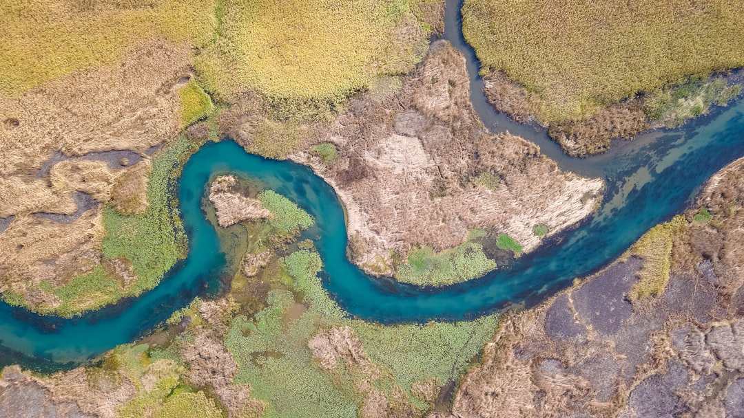
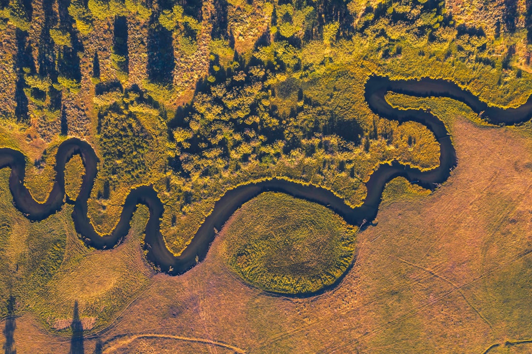
Image not found in postmetaPopular Symbols for Land Management Logos
Nature-based icons are common in land management branding, but the best logos use them with restraint. A leaf, tree, mountain, river, field, or horizon can be effective if it is simplified and made distinctive. Problems arise when a design becomes too generic or tries to include every part of the business in one small mark.
Consider these symbol directions:
- Trees and forests: Ideal for forestry, habitat restoration, arborist services, timber planning, and conservation work.
- Leaves and seedlings: Useful for sustainability, restoration, soil health, and ecological consulting brands.
- Mountains and hills: Strong for rural property services, watershed management, recreation land, and western or rugged brands.
- Rivers and water lines: Appropriate for wetland consultants, erosion control firms, drainage services, and watershed specialists.
- Topographic lines: Excellent for companies that use mapping, GIS, surveying, planning, or scientific assessment.
- Property boundaries: A square, plot outline, fence line, or map pin can suggest ownership, management, and land organization.
- Wildlife silhouettes: Deer, birds, fish, and pollinators can work well for habitat, hunting land, conservation, and ecological services.
The strongest logos often combine two ideas. For example, a tree made from contour lines can suggest both ecology and technical mapping. A river flowing through a property grid can communicate both natural systems and land planning. A leaf set inside a shield can convey sustainability and protection.
Choosing the Right Color Palette
Color plays a major role in land management logos because it instantly sets the emotional tone. Green is the obvious choice, but it is not the only choice. In fact, many businesses in this sector use green, so choosing the right shade and pairing it with complementary colors can help your brand stand out.
- Deep green: Communicates stability, forestry, maturity, and environmental responsibility.
- Sage or olive: Feels natural, calm, and professional, often suitable for consulting or conservation.
- Brown and earth tones: Suggest soil, property, agriculture, ruggedness, and reliability.
- Blue: Works well for water resources, environmental science, drainage, and clean systems.
- Charcoal or dark gray: Adds authority, balance, and a technical or corporate feel.
- Gold or tan: Can reference fields, sunlight, harvest, and premium land services.
A good rule is to build a palette with one primary color, one supporting natural color, and one neutral. For example, forest green, warm tan, and charcoal can feel grounded and professional. Sage, river blue, and dark gray may suit an environmental consulting firm. Olive, rust, and cream can create a rustic yet refined look for ranch and rural property management.
Typography: The Quiet Signal of Professionalism
Typography is often overlooked, but it can make or break a logo. Land management brands usually need to balance field-tested practicality with professional credibility. That balance can be achieved through clean, readable type rather than decorative fonts.
Serif fonts can suggest tradition, land ownership, heritage, and trust. They may be a good match for estate management, forestry firms, agricultural consultants, or companies serving long-standing rural communities. Sans serif fonts feel modern, efficient, and technical, making them suitable for environmental engineering, GIS-based services, vegetation management, and municipal contracts.
For a more custom identity, letterforms can include subtle references to the land. A horizontal line through the text may evoke a horizon. Slightly rounded letters can feel organic. Wide, sturdy capitals can suggest durability and reliability. However, readability should always come first, especially because logos often appear on trucks, equipment decals, safety gear, and roadside signs.
Logo Styles That Work Well in the Industry
Different service categories call for different visual styles. A single-person land maintenance company and an environmental planning firm may both work with land, but they should not necessarily look the same.
1. Modern Minimalist
A minimalist logo uses simple lines, limited colors, and clean typography. This style works well for consulting, GIS, environmental planning, and companies that want to appear precise and current. A contour line icon, simplified leaf, or abstract property shape can be enough.
2. Rustic and Heritage Inspired
This style uses earthy colors, badge shapes, textured typography, and symbols such as trees, barns, fences, hills, or wildlife. It can be effective for ranch management, rural estate services, forestry operations, and landowner-focused businesses. The key is to keep it refined rather than overly nostalgic.
3. Technical and Map Based
Topographic lines, grid patterns, compass marks, coordinates, and boundary shapes can create a strong visual connection to data, planning, and field assessment. This approach is especially useful for environmental consultants, survey-adjacent services, drainage planners, and firms that produce formal reports.
4. Conservation Focused
Conservation logos often feel softer and more organic. They may use wildlife, native plants, water, soil layers, or circular ecosystem motifs. This style should communicate care, but it should still look professional enough to earn trust from agencies, grant committees, and landowners.
Designing for Real-World Use
A land management logo must perform in tough environments. It may be printed on a reflective truck door, embroidered on a jacket, stamped on a field report, placed on a drone case, or displayed on a sign at a muddy job site. This means your design should be versatile, scalable, and easy to reproduce.
Before finalizing a logo, test it in several formats:
- Small size: Does it remain recognizable on a business card or mobile screen?
- One color: Can it work in black, white, or a single ink color?
- Embroidery: Are the lines thick enough for hats, shirts, and jackets?
- Vehicle graphics: Is it readable from a distance?
- Document headers: Does it look professional on proposals, reports, and invoices?
- Outdoor signs: Will it stand out against trees, soil, sky, or construction backgrounds?
Complex illustrations may look attractive on a screen but fail when placed on equipment or reduced for social media. A simpler mark is often more memorable and more practical.
Branding Ideas by Service Type
Because land management covers many specialties, your logo should reflect your strongest market position. Here are a few targeted ideas:
- Property management and land maintenance: Use symbols of boundaries, fields, fences, roads, or a strong monogram. Choose durable colors such as forest green, brown, navy, or charcoal.
- Forestry and timber services: Consider tree rings, pine silhouettes, canopy shapes, axes used subtly, or contour forms. Deep greens and warm wood tones work well.
- Environmental consulting: Use refined natural symbols, water lines, native plants, or abstract ecosystems. A clean font and restrained palette can signal scientific credibility.
- Erosion control and drainage: Flowing lines, slopes, soil layers, and water movement can communicate the service clearly. Blue, brown, and gray are useful colors.
- Habitat restoration: Wildlife, seedlings, pollinators, grasses, and circular renewal motifs help express ecological recovery.
- Agricultural land planning: Field rows, horizons, soil, sun, and crop patterns can create an immediate connection to productive land.
Common Logo Mistakes to Avoid
Many land management logos fail because they become too literal or too crowded. A logo does not need a tree, deer, river, mountain, sun, shovel, tractor, and map all at once. Too many elements make the design hard to read and difficult to remember.
Other common mistakes include:
- Using generic clip art: A familiar tree or leaf icon can make your company blend in with competitors.
- Choosing weak contrast: Pale green on tan may look natural but can be hard to read.
- Ignoring typography: A strong icon paired with an awkward font can feel unprofessional.
- Overusing gradients and details: These effects often reproduce poorly on signs, shirts, and equipment.
- Following trends too closely: A trendy logo may feel outdated in a few years, while land-based businesses often benefit from timeless design.
How to Make Your Logo Feel Distinctive
To stand out, look for visual details that are specific to your business, region, or philosophy. A company working in coastal wetlands can use marsh grass, tidal lines, or a heron-like form. A mountain-region land services firm might use elevation lines or a ridge silhouette. A prairie restoration business could reference native grasses, seed heads, or open horizon lines.
You can also build distinction through structure. A custom monogram based on your initials may be more ownable than a generic tree. A badge logo can make a rural services company feel established. A geometric landscape mark can help a technical firm appear modern and precise.
The goal is not to create a complicated story. It is to create a simple visual identity with enough character that people remember it after one or two encounters.
Bringing the Brand Together
A logo is only one part of a complete brand system. Once the main mark is established, develop supporting elements: a color palette, secondary icon, typography rules, photo style, map graphics, proposal templates, signage standards, and vehicle layouts. These pieces help your company look consistent wherever clients encounter it.
For land management businesses, photography and imagery are especially important. Use real landscapes, field teams, equipment, restored sites, healthy forests, waterways, and before-and-after project visuals. Pair these images with a logo that feels strong but not overpowering. The brand should support the work, not distract from it.
Final Thoughts
The best land management logos combine clarity, trust, and a genuine connection to place. They respect both the business side of property services and the environmental responsibility that comes with managing natural resources. Whether your company is rugged and hands-on, scientific and advisory, or conservation-focused and community-minded, your logo should reflect the value you bring to the land.
Think of your logo as a compact field sign for your reputation. It should tell clients that you understand terrain, resources, responsibility, and results. When designed with intention, a land management logo becomes more than a visual mark; it becomes a symbol of stewardship, capability, and long-term care.